
SELECTED WORK • 01
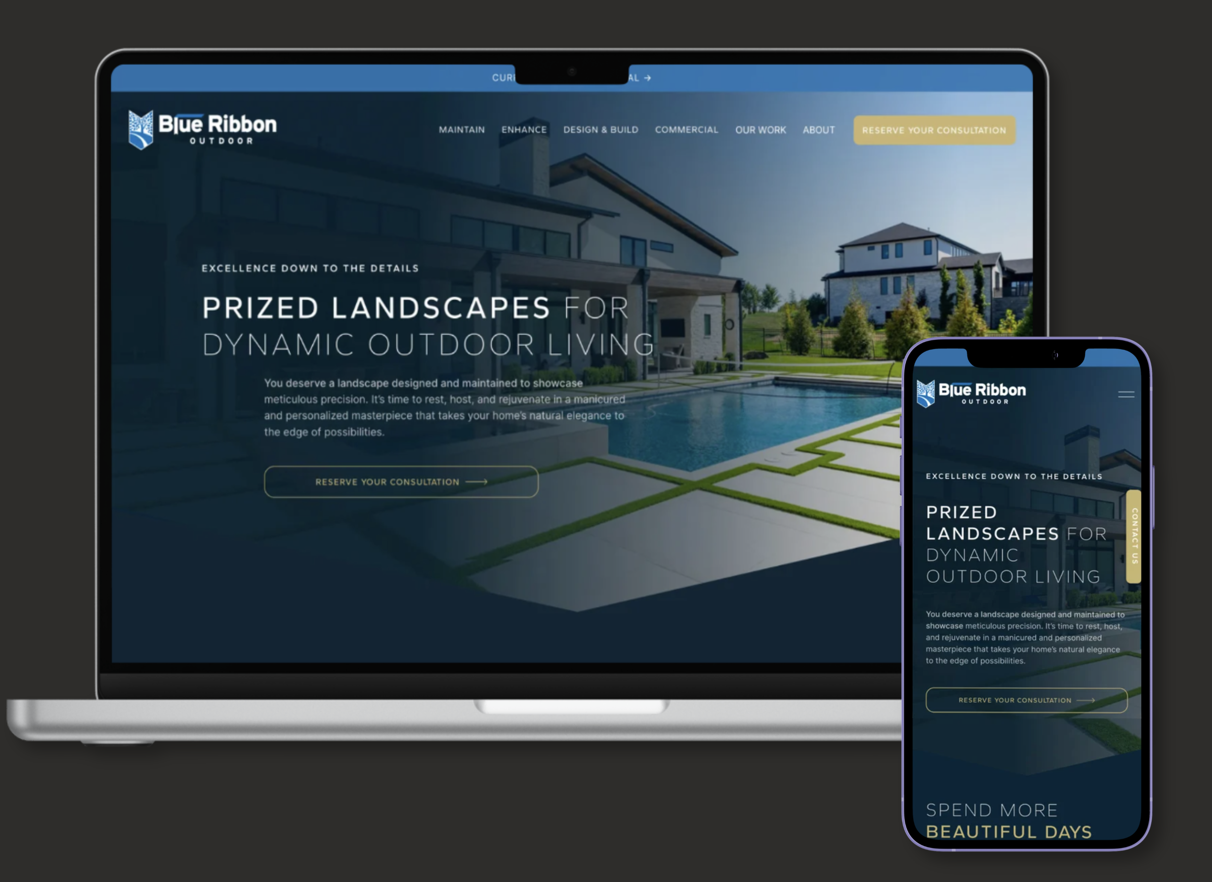
FEATURED PROJECT
Blue
Ribbon
PRIMARY GOAL
Redesign the digital experience for a $12M landscaping enterprise, with a primary focus on generating long-term maintenance contracts and a secondary focus on Design & Build services.
PROJECT SCOPE
Website redesign, information architecture, visual system, interaction design, responsive layouts, implementation, and testing.
KEY CONSTRAINTS
→ A highly content-heavy site with SEO-driven copy across every page.
→ Premium visual direction without sacrificing usability.
→ Squarespace limitations requiring custom HTML/CSS and Squarekicker.
ROLE
Visual & Interaction Designer
TOOLS
Figma, Squarespace, Squarekicker, HTML/CSS
TEAM
Project Manager, Copywriters, SEO Manager, Head of Creative
Overview
Blue Ribbon Outdoor is a premier landscaping and outdoor services company serving Northwest Arkansas.
Following the merger of multiple independent businesses, the company had grown into a $12M operation with a substantial physical footprint, an elite fleet, and a high-end residential and commercial clientele. Its existing website, however, did not reflect the scale or quality of the business.
I worked as the Visual & Interaction Designer as part of the Halstead Media team, collaborating with the Project Manager, copywriters, and SEO Manager to redesign the digital experience and bring Blue Ribbon's online presence in line with its evolving business.
The new site launched alongside a period of company growth, contributing to a 56% year-over-year increase in revenue and a 31% increase in organic demand.
01.
The Challenge
The company had evolved from several independent landscaping businesses into a $12M operation serving high-end residential and commercial clients, but its website still communicated the scale of a much smaller local business.
The existing site was simple and relatively easy to navigate, but its limited visual language and basic presentation didn't communicate the quality, breadth of services, or level of clientele Blue Ribbon had grown to serve.
The redesign needed to do more than improve usability. It needed to establish authority, communicate a premium level of service, and create a digital experience that matched the business Blue Ribbon had become.
BUSINESS GOALS
Establish Blue Ribbon as a premium, full-service landscaping provider
Prioritize long-term maintenance contracts as the primary conversion path
Create opportunities to introduce enhancements to maintenance clients
Position Design & Build as a secondary offering
Support residential and commercial growth
Build credibility with high-end prospects across the Northwest Arkansas market
LEGACY SITE
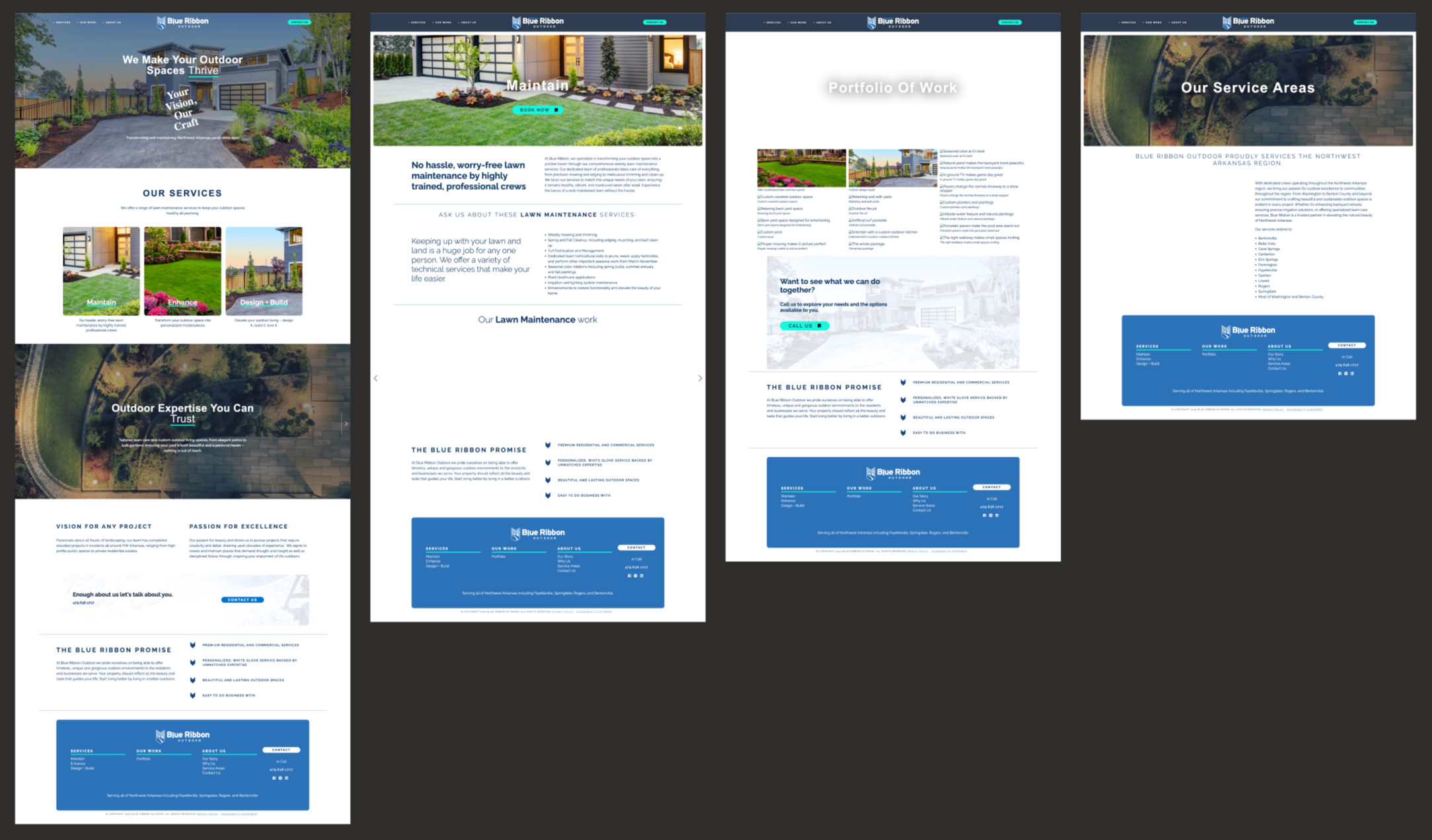
OPEN COMMUNICATION
WHITE GLOVE SERVICE
INDUSTRY-LEADING METHODS
OPEN COMMUNICATION WHITE GLOVE SERVICE INDUSTRY-LEADING METHODS
02.
Audience & Market Research
Blue Ribbon’s target audience was defined through client discovery and competitive research conducted at the beginning of the project.
Blue Ribbon served Washington and Benton counties and surrounding communities, with a primary audience of sophisticated, luxury-oriented homeowners and country-club clientele seeking quality, reliability, and long-term care.
I also reviewed regional competitors to understand how premium providers positioned themselves online, organized their services, and communicated expertise and trust.
Primary audience
High-end homeowners seeking ongoing landscape maintenance
Homeowners looking for a premium, full-service landscaping partner
Clients interested in ongoing enhancements to an existing property
Secondary audiences
Homeowners seeking design & build services
Commercial property owners and decision-makers
Prospective clients researching Blue Ribbon within its regional service area
Competitive research focused on:
Service and navigation structure
Premium positioning
Visual presentation and photography
Content hierarchy
Calls to action and conversion paths
Ways competitors communicated expertise and credibility
03.
Design System & Layout Architecture
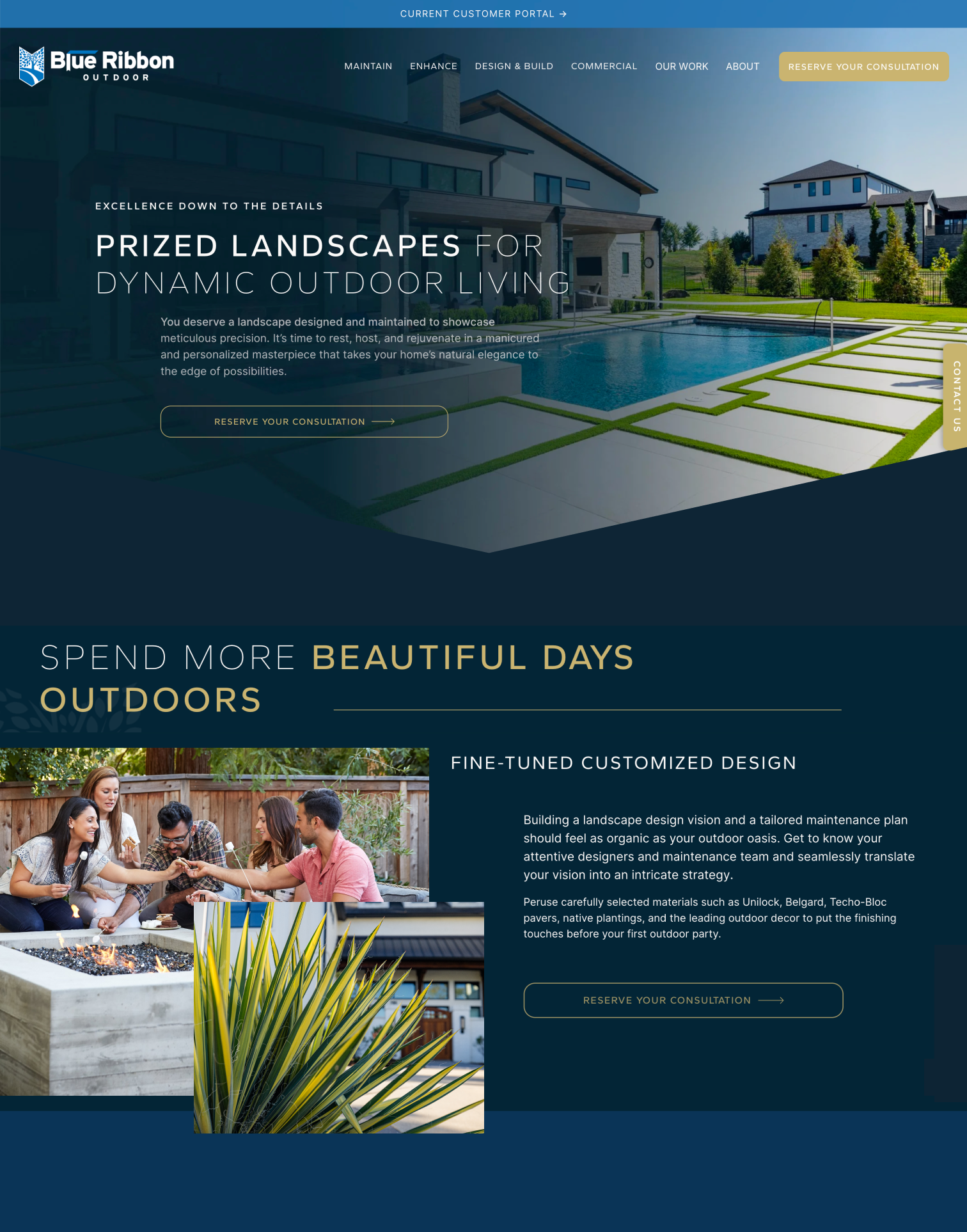
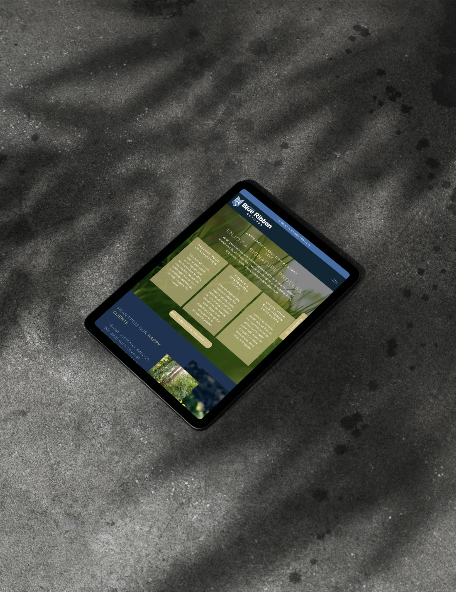
Working within the structural framework established by the Project Manager and copywriters, I translated Blue Ribbon’s existing logo into a digital visual system designed for a premium audience.
Logo-Driven Geometry
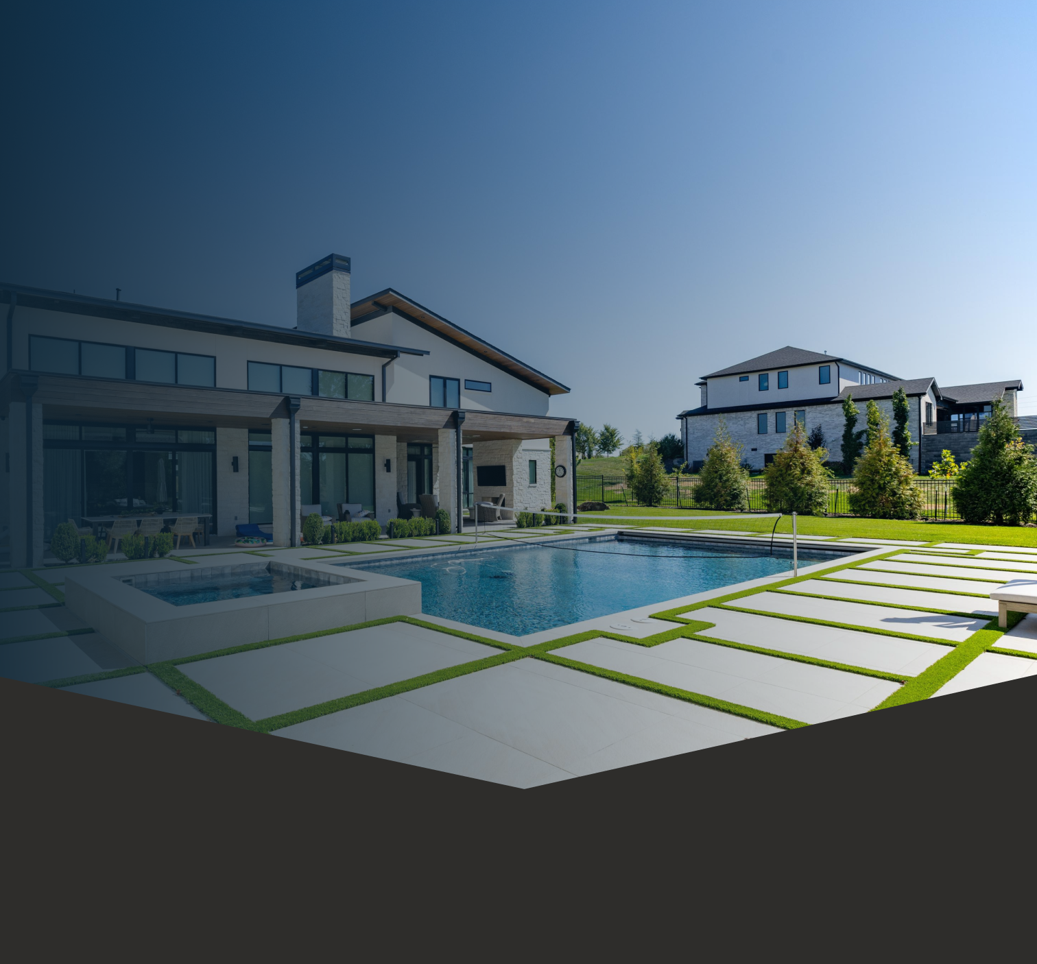
To ground the brand visually, I extracted the "V" shape contour from the bottom of Blue Ribbon's logo emblem:
Custom Section Headers: Shaped container blocks mirror the emblem's distinct angle across key sections.
Subtle Branding Overlays: Low-opacity white outlines of the emblem reinforce the brand within layout backgrounds without distracting from imagery or content.
Segmented Visual Architecture
The site structure was organized around distinct service categories and user paths, helping visitors quickly identify the experience most relevant to their needs.
Clear Pathing: Distinct service cards and navigation entry points help homeowners and commercial buyers quickly identify the service path most relevant to them.
Scannable UI Layouts: Visual hierarchies break up dense offerings so visitors can quickly understand the content and navigate deeper into each service area.
Color & Typography Foundations
Color System: A deep navy base establishes a sophisticated foundation, balanced by warm gold accents for actions and soft off-white for high-contrast reading.
Typography: Uppercase Fustat for eyebrows and labels, bold Gantari for large titles, and clean Inter for body text create a clear visual hierarchy.
#0D2435
Prussian Blue
#173454
Berkeley Blue
#3A6EA6
YInMn Blue
#C6B476
Ecru
#FBFAF9
Cotton Bloom
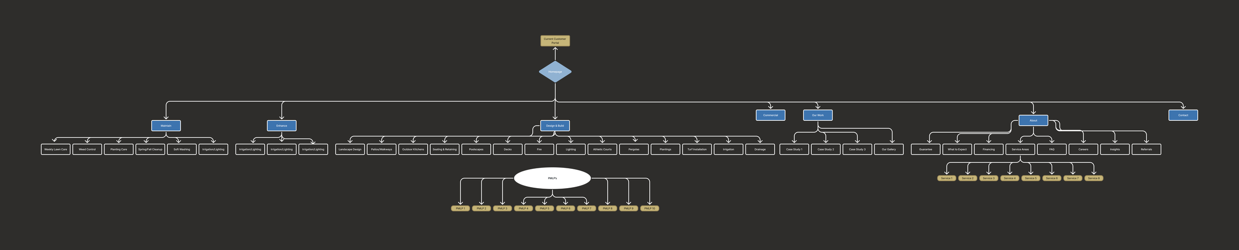
Blue Ribbon Sitemap
The site was a large-scale content ecosystem structured around four core business pillars: Maintain, Enhance, Design & Build, and Commercial. Working within the established content structure, I created intuitive visual entry points for each service and user path.
04.
Designing for Clarity Within a Content-Heavy Experience
The project was highly marketing-led, with substantial copy on nearly every page to support SEO and communicate Blue Ribbon’s breadth of services. The challenge was balancing that volume of content with a sophisticated, highly designed experience.
I focused on helping visitors quickly understand where they were, what mattered most, and where to go next.
Designing for Scannability
With substantial content across the site, I created strong visual hierarchies using section titles, eyebrow labels, concise content groupings, imagery, and distinct CTA treatments.
Rather than removing content, I organized and prioritized it so users could scan the page while still understanding the key message.
Using Photography to Create Connection
Photography was used to communicate the experience Blue Ribbon was selling, not just the services it provided. I carefully paired imagery with individual sections based on the content, composition, and overall visual rhythm.
Creating Clear Conversion Paths
Calls to action were intentionally consistent throughout the experience, using the gold accent as a visual signal for interactive elements. This was particularly important for a site designed to generate maintenance leads and consultation requests.
Balancing Sophistication With Approachability
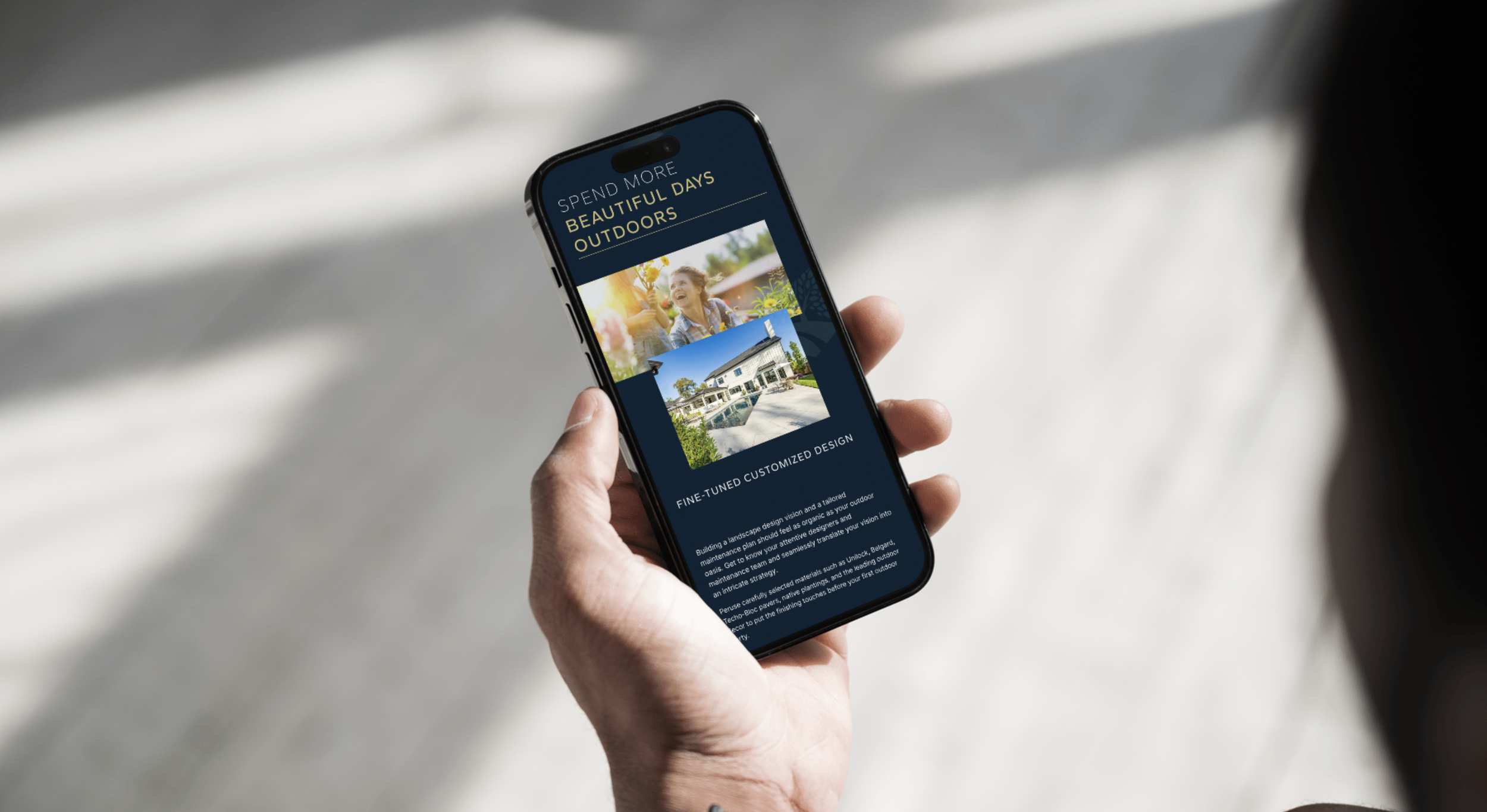
The visual direction needed to feel premium without becoming cold or difficult to navigate. I paired strong typography, rich photography, layered layouts, and restrained motion with straightforward navigation and high-contrast content presentation.
05.
Agency Workflow:
Vision Board to Build
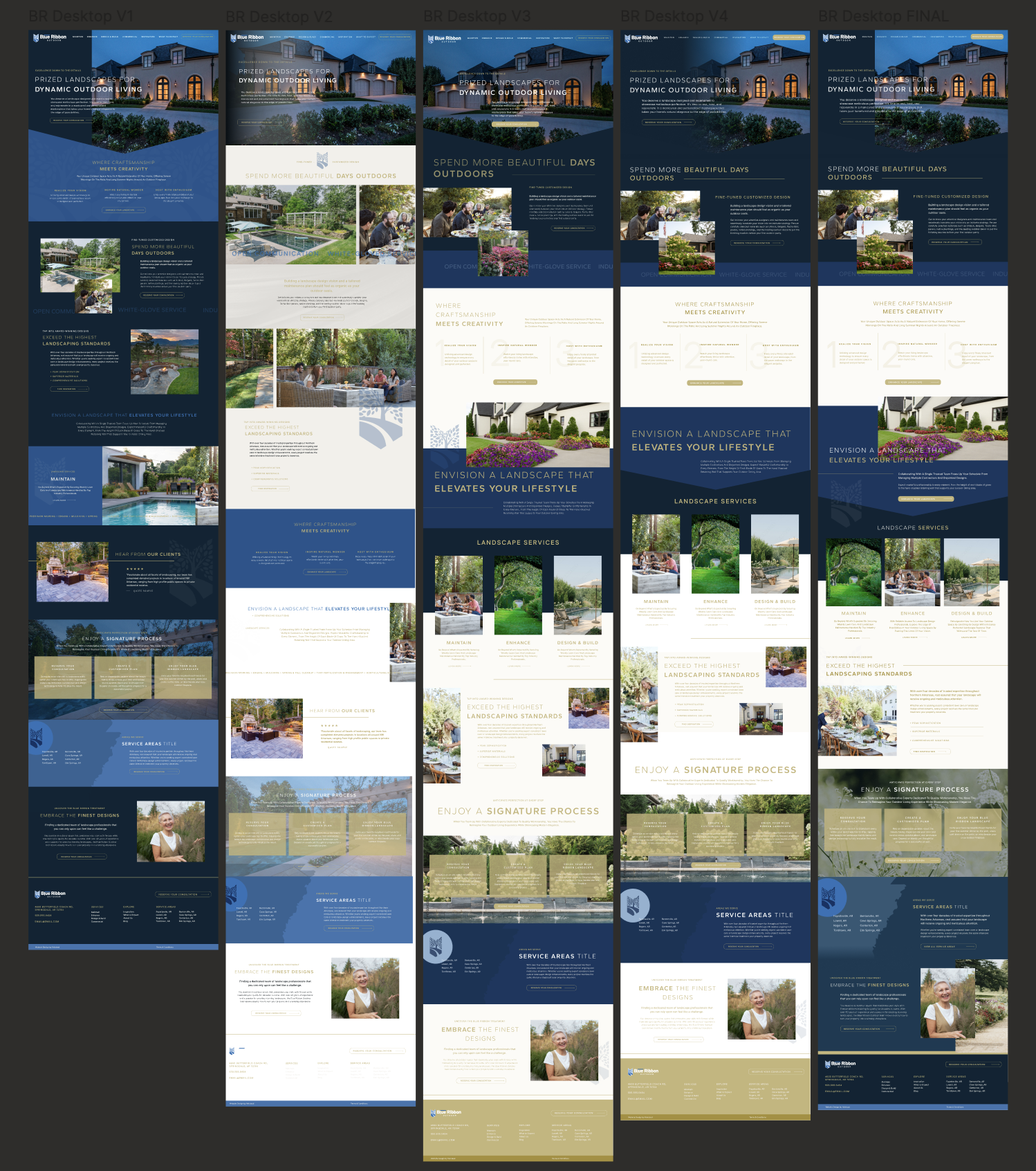
The project followed Halstead Media’s structured agency workflow, moving from visual exploration to high-fidelity Figma designs and final Squarespace implementation.
1. Vision Board & Interactive Direction
I established the visual direction through a comprehensive vision board covering color, typography, visual references, and interaction benchmarks.
2. Figma Layouts & Interactive Prototypes
I translated the approved direction into low- and high-fidelity Figma layouts, developing responsive grids, page structures, micro-interactions, and hover states.
3. Video Walkthrough & Feedback Cycles
I shared interactive prototypes and Loom walkthroughs with the Project Manager and client, working through multiple rounds of feedback to refine the experience.
4. Squarespace Build & Squarekicker Motion
I translated the approved designs into Squarespace, using Squarekicker and custom HTML/CSS where needed to achieve the intended layouts, responsive behavior, and interactions.
06.
Testing, Iteration & Implementation
Once the site was built, I worked through multiple rounds of testing and refinement with the Blue Ribbon and Halstead teams.
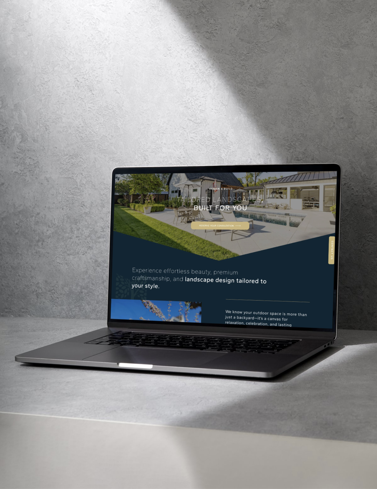
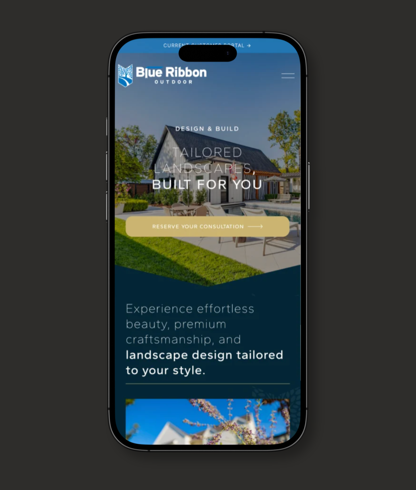
I reviewed the experience across devices, browsers, and responsive breakpoints, testing navigation, CTAs, interactive states, typography, and visual consistency between the Figma designs and live implementation.
Custom Implementation
Squarespace provided the foundation for the build, while Squarekicker and custom HTML/CSS allowed for greater control over animation, interaction, layouts, and responsive behavior.
07.
Visual Assets & Motion
The site relied heavily on photography and video to communicate the quality and scale of Blue Ribbon’s work. I curated and paired imagery with individual sections based on content, composition, color, and visual rhythm.
Subtle motion—including scroll-triggered transitions, overlapping imagery, and reactive hover states—added movement to content-heavy layouts while supporting hierarchy and engagement.
08.
Outcome & Impact
The redesign gave Blue Ribbon a digital presence that better reflected the scale and quality of its business while creating clearer pathways for residential and commercial prospects.
The site launched during a broader period of company growth, alongside measurable gains in revenue, organic demand, and customer engagement.
The new site strengthened Blue Ribbon’s digital foundation, aligning its visual identity, content structure, and user pathways with its evolving business goals.
56%
Revenue growth year over year
+31%
Organic demand growth
150%
Growth in Google reviews, all five stars